Accessible Design: Bringing Your Electronic Message to More Customers
6/7/2018 RRD
Accessible design — or approaching your design to consider people with disabilities — shouldn’t be limiting. In fact, think of it as elegant design that makes it easier for all of your customers, including those who deal with disabilities. Designing for accessibility is easier on the eyes and elevates the customer experience.
If you don’t reach your company’s customers with disabilities, you’re ignoring a significant minority — 15% of the world’s population, making them the world’s largest minority, according to the World Health Organization.
Vision, mobility, and hearing are major categories to keep in mind when creating accessible design. Your customers need big print, screen reader software, more screen time before timeouts and captions on video to better digest your messaging.
Cognitive impairment is a growing sector within this demographic. Mild cognitive impairment is common for those 65 and older, according to the National Institutes of Health. In the United States, that population is expected to more than double from 46 million in 2016 to top 98 million by 2060, according to the Census Bureau. Others affected include those with ADHD, post-traumatic stress disorder, and traumatic brain injuries. These groups have trouble concentrating, remembering, learning new things, and/or making everyday decisions and may give up if your dazzlingly designed electronic communications are difficult to navigate.
Accessible design saves money
Not only is investing in accessible design the right thing to do, there is a huge risk for companies who do not make sure their design is accessible. The Americans with Disabilities Web Content Accessibility Guidelines requires your digital landscape to be accessible to disabled consumers, and those who don’t comply face lawsuits. In one of many cases in 2017, a Florida judge ruled in favor of a blind man who claimed that Winn-Dixie caused him injury because the grocery chain’s website was incompatible with standard screen reader software.
Not only is investing in accessible design the right thing to do, there is a huge risk for companies who do not make sure their design is accessible.
Accessible design requires slightly more resources. On average, your company will spend 5-10% more to incorporate these factors into a new design. However, integrating accessible design from the beginning is less expensive than revamping existing e-communications. In the case of the latter, you’re looking at spending at least 50% more for updates, as you must to go back into the design to redo tags and solve other problems after you add features to make an existing design accessible. Of course, that doesn’t include the savings realized by avoiding a potential court battle.
Here are some ways to better engage those with disabilities.
Impaired vision: Orange is not the new black
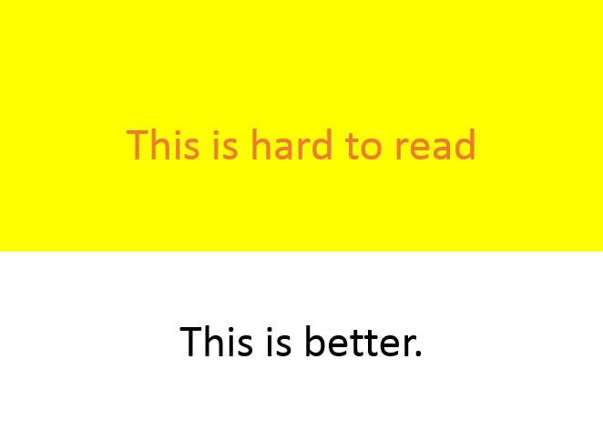
Black print on a white background is an excellent first choice for clear visibility but is not realistic for every design. As you move to color, be sure to use it carefully. Contrast is your friend. That means no orange font on a yellow background or vice versa. That color scheme can be tough and/or annoying — even for people with perfect vision.
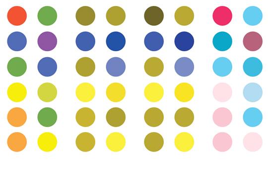
For the color-blind, your cool Christmas design might result in full grayscale
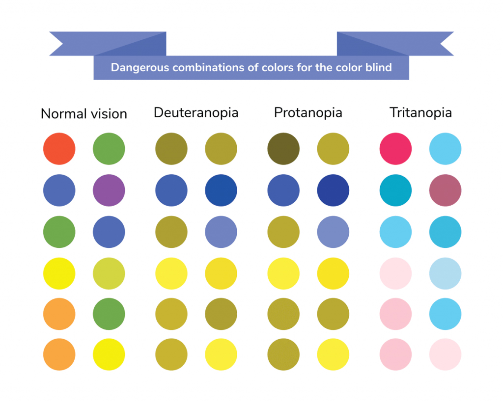
The above graphic showcases colors that are hard to differentiate for color-blind people, such as red and green.
Even throughout the holidays, skip the red font on green background because that shows up as shades of gray for color blind people.
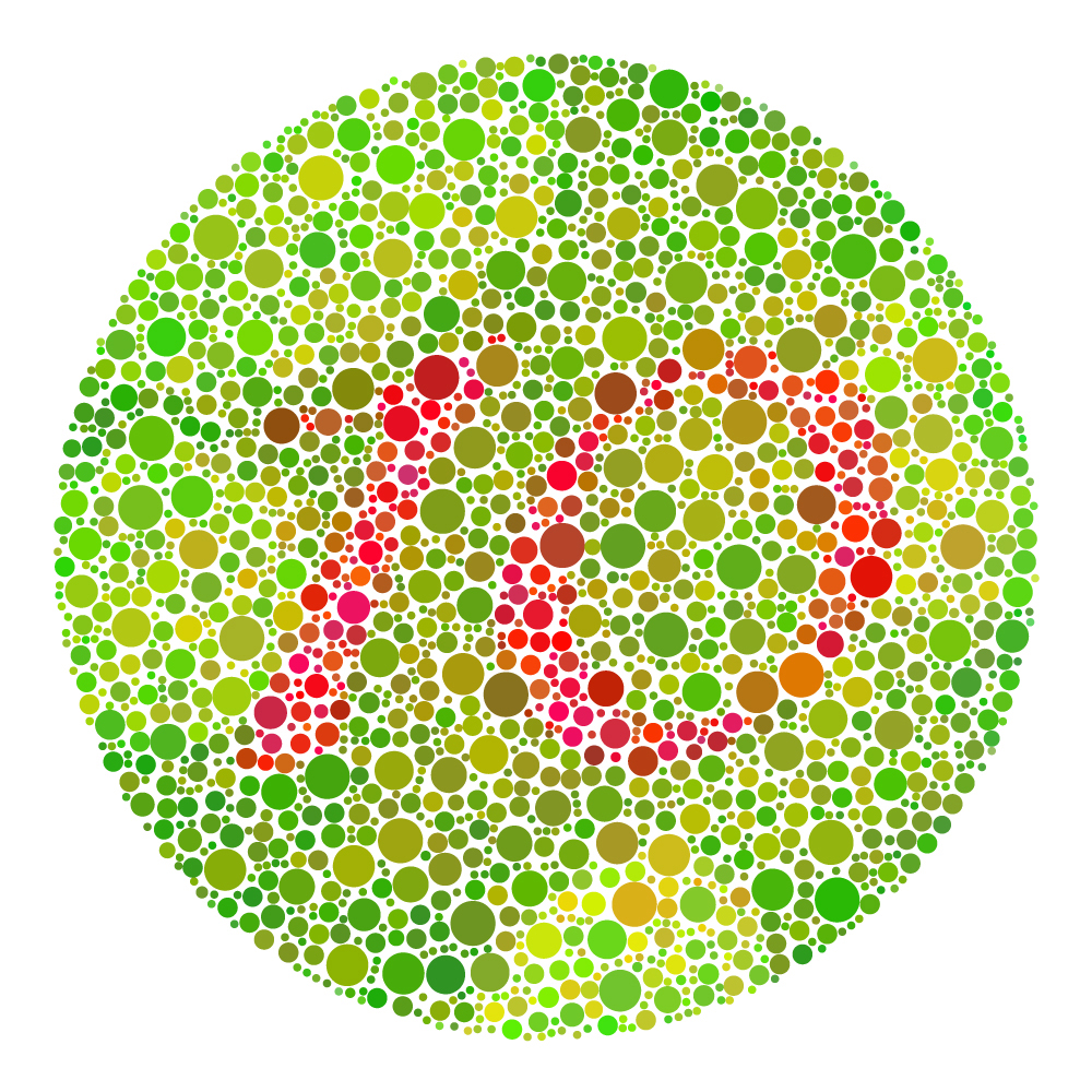
The above graphic is used to test color blindness. While most people will see the red and green, some color-blind people will not.
Magnify your message
A simple solution for magnifying your message is creating PDFs with large type — minimum 18 point — and changing the orientation from portrait to landscape.
Amplify your message
When you add screen reader software (notice that’s “when,” not “if”), you have options. With the abundance of software on the market, it is important to test the pronunciation of the tags. This is especially true when related to acronyms. For example, ‘NASA’ should sound out fine on such software but “USA” could become “use-ah” and “FBI” could become “fuhbye”.
Caption your message
For your deaf and hard-of-hearing audience, add captions to any video in your electronic messages and add a typed version to supplement audio files.
Nix the nesting tables
When your company uses tables in electronic communications, keep them simple. Nesting tables — those with more rows or columns within the table — are difficult for people with cognitive impairment to navigate. Nesting tables can create confusion for the screen reader software and may read out of order.
Leave out screens and watermarks
Keep print and images separate. Skip the shadows, ghosted images, watermarks, and 10% screens overlaid with print, as both the image and the print are hard to read.
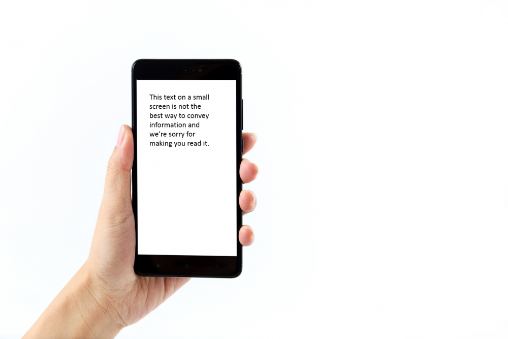
Tip: iPhones and other screens are often great images for your communication material — but keep your text and imagery separate.
Images definitely play an important role in accessible design. People are visual. It’s much easier to connect to

than to the words “stop.”
If your image needs explanation, make sure you provide it. Each image must have a purpose in conveying the message: simply making the design look better isn’t enough.
Also, make sure you use alternative text for all of your images so that readers can understand the message intended in the visual. Not only does this make your design more accessible, it also helps consumers who are reading your content on a mobile device without the images loaded.
Watch out for mousetraps
For customers with mobility issues, manipulating a mouse can be slow, painful or impossible. Reduce or eliminate what people have to click on and those clients will stay with your message longer.
Lengthen time before timeouts
Keep in mind that your audience may need more time to get through your e-messaging. So give them more time before the message times out.
Remember: If your beautiful, flashy, cool communication is not serving its purpose — getting your message across — then it failed.
Cynthia Bajana is vice president of sales and Jennafer Brechtel-Higgins is creative director, information design for RRD Business Communications Solutions.
How can we help you make your communication accessible? Contact us today.
This post was originally published June 6, 2018.